贺年图
兔年吉祥,国泰君安,吾辈自强,世界和平!
illustration
贺年图

兔年吉祥,国泰君安,吾辈自强,世界和平!
又是一个过程分享帖。

画草稿时,借助了彩色铅笔作为上色工具,并使用了我之前很少敢用的暗调和黄紫作为对比色(我非湖粉,但是湖Cares?)。
我又画了左上这幅豆腐块草稿,把竖版改为横版,在左边加上了辛普猴的朋友潘达,以及一票漫画中出现过的角色,包括和我自己设计的无人机、摩托车和汽车。

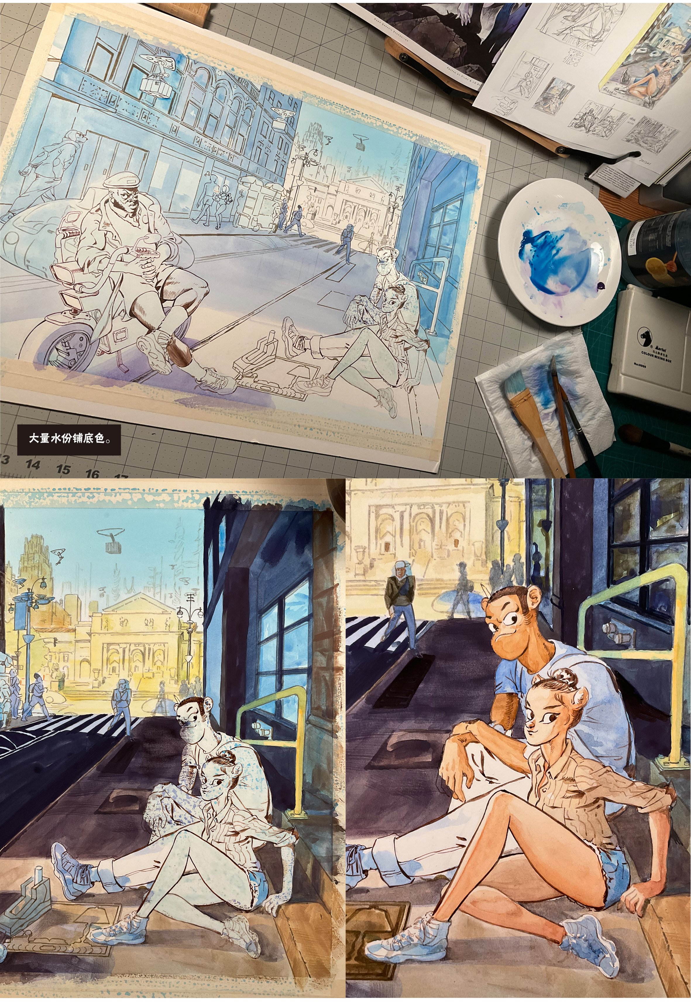
为了能画出草稿中彩铅丰富的叠加效果,以及纽约市街区间那种对比强烈的光线“影调”。我决定使用水粉颜料进行上色。对应水粉颜料,相对于平常用惯的漫画稿纸,这次选用了大幅尺寸51x41cm (20x16 inches) 的Canson Illustration Art Board。

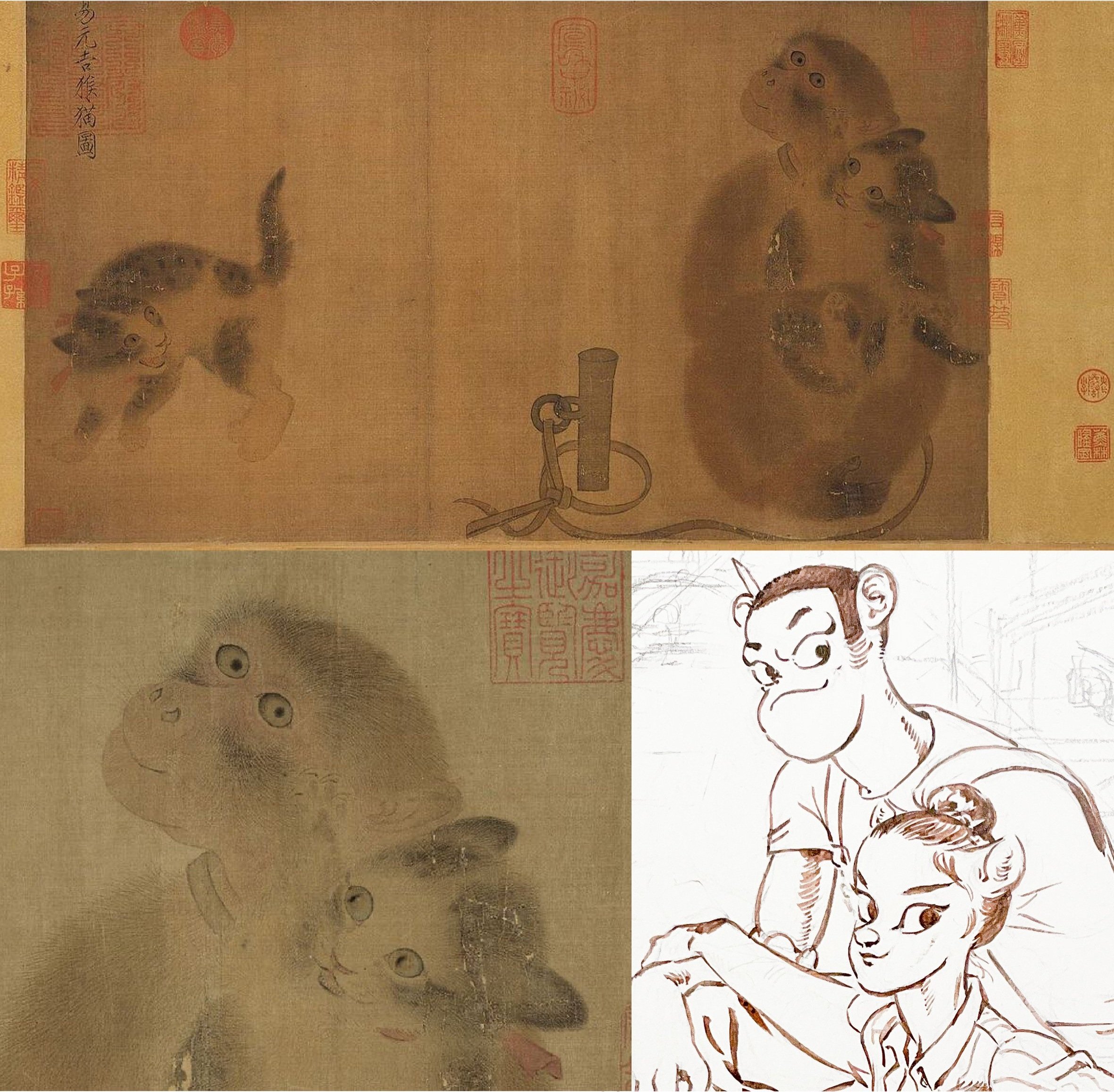
北宋有张画《易元吉猴猫图》,画上一只被拴在桩子上的猕猴抓住路过的小猫,一把搂在怀里,被俘虏的小猫耳朵向后别起,伸爪向猴挠去,仿佛在喊:放开我,你个臭流氓!同伴的小猫更是惊恐,弓起身子张嘴哈猴。而被囚禁的猴子,这时候却面露出顽皮怜爱的神情。仿佛再说:来嘛,就亲一下!是啊,谁不喜欢好看的小猫呢?
无意中发现自己的画和一千多年前的国家宝藏居然搭上了丁点缘分,请受晚辈一拜!
这幅画的作者叫易元吉,生活在11世纪后半,画面左上方“易元吉猴猫图”传说是宋徽宗所题。画为绢本设色,大小31.9x57.2cm,藏于台北故宫博物院。
北宋画家的写实能力实在太了不起了,初看传神生动,细看看猴和猫的毛发均由细笔轻色勾勒、梳渲,精细入微,一丝不苟。人说:“元吉平日作画,格实不群,意有疏密,虽不全拘师法,而能仗义古人,是乃超忽时流,周旋善誉也。”都是画画的,且知道要达到易元吉这样的水准,得是多少年心血投入啊!


左上这是涂了水彩画中常用的遮盖液(Masking Fluid),为保证背景笔触的完整,用了这个方法。也有的画家用可粘薄膜贴上(有点像网点纸),然后用美工刀切下作为遮盖,但那种方法很容易割坏纸面,要慎用。右边是擦去遮盖液(干了之后像面膜)后上色的一步。

过程1-2-3

画面的左边是正上班的图书馆管理员 杰克拉多,辛普猴的前队友、图书馆保安、哈林区最后的大前锋查尔斯(外号潘达),这里潘达倚靠的电动摩托,背后的汽车,和头顶上的送货无人机,都是我自己设计的。从一开始的草稿可以看出,潘达一开始穿的是保安穿的长裤,但是受近来潮流的影响,我给他脱了。话说,潘达这双腿,我可是画的挺满意的。

夹带的私货自然无需多说,1995-96那个不可思议的赛季,父亲节那天的冠军,更衣室扑地大哭的那一刻,这双鞋变成了篮球的历史符号。同时我跟你说,这也是最难画的一双鞋。不信你试试。

全彩色画幅,对画家来说是基本功的全方位考验和锻炼。从构建画面,酝酿故事,铅笔打稿,到以水调色,面对无数变幻莫测的可能性,需要耐住性子,一边逐渐深入,一边把握全局,没有数字绘画的Undo键和历史记录,没有TimeMachine,没有可以反复叠加的图层或方便的现成笔刷帮你,必须不断冒着搞砸了就玩完的心态,不断挑战自己。我觉得这才是绘画的真正意义,在越过了重重难以选择的关卡之后,回头再看之前的那个自己,才会看到进步。

完成稿。
这幅画中发生的是,这天潘达午休时,辛普和凉皮来找他玩最新的全息投影冒险游戏《辛普猴在纽约图书馆》。
三人避开人挤人的布莱恩特公园,来到图书馆路,辛普猴的摩托车停在这里。
潘达:"Big Time! 你还骑着这辆摩托呢,这能载的下你们俩?"凉皮喵:“啊,这车又不小?”
辛普猴边把全息投影打开,边对凉皮说:我俩屁股加在一起都没他一个大!
凉皮看着倚在摩托车上勉强能坐的潘达,噗的笑出声来。
Someone told me that she wished to hang my drawing on her new home's wall. Then she send me the photo of the repainted wall and size (luckily, no deadline). The size was 15X19 inches, it was the largest size that I had been commissioned for the last 3 years. I was so excited and got to started immediately.
有人对我说,家里新装修完的墙上希望能挂上我的画,并发来了墙的照片和尺寸。画的尺寸是40x50厘米。已经三年没有接到这么大尺寸的订单的我,激动的立刻开始构思。
As a fan of SimpHoo and CoolNoodle, my client certainly have no problem about seeing my 2 characters standing on New York street. I had a lots of fun by drawing these sketches:
下单的这位是辛普猴和凉皮喵的粉丝,所以自然以这俩宝贝为主角,和我居住的纽约为背景为主题。想到纽约的街景,想法就一张接一张冒了出来。如下是最初的草图。

These are the snapshot of the city where I lived: The street side of Soho, the studio of SimpHoo, upperWest twilight, laundry downstairs, and the iron bridge on east 125th Street.
这几个场景都来自我居住的城市:口香糖满地的Soho街边人行道;辛普猴的工作室内;上西区街边入夜时分;楼下的洗衣店和东125街铁桥下。
My client chose the last one without any hesitation. Her comment was: I can smell the spring on it!
客户毫不犹豫地选择了最后一张,她的回复是:仿佛能从这张画里闻到春天的味道呢。
But client is always client, she also showed her "dislike" about CoolNoodle's orange short. It wasn't about the color, she just simply didn't like the style of the short. To me, the reason I put this short on her was because I need a complementary color to POP-UP girl's blue Knicks jacket.
但是客户总是客户,她对凉皮的橘色紧身短裤表示了“不喜欢”。偏偏这条橘色短裤是衬托其蓝色纽约尼克队棒球服的重要色彩元素,如果换成其他的色彩或是款式,就会减弱对比色的力量,也凸显不出凉皮喵浑圆紧实的臀部。
So I tried another round for the combination:
于是,我又试了下面三个不同的搭配。

This time, the client chose the 1st version with denim short. Actually I like girls wearing that too, especially the low-rise and you can actually see the lower half butts. I didn't draw that at the 1st time simply because I drew it too much. BTW, I really don't like the the high-waisted loose short!
这一次,客户很干脆地选了第一张穿牛仔短裤的版本。其实我也喜欢牛仔短裤,一定要低腰能看见屁股下半个圆的那种,第一稿草图没用牛仔短裤唯一的原因就是因为画的太多了。顺便说一句,今年流行的那种松松垮垮的高腰牛仔短裤真是太难看了!

Further sketches, confirming the tones and color combination. For the first time I tried this "curve perspective".
进一步,确定构图,黑白灰和色彩关系的两个阶段。第一次尝试用了一个“弧形”透视来框住背景中的铁桥。
When you have the same taste with your client, things always get easier. But I had to find a way to solve the complementary problem. I tried this: Adding a yellow traffic light on the left and choosing a more cheerful posture for CoolNoodle by raising her leg and turning her head toward the camera. And that did make the difference.
当你和客户的品味一致,总是能让事情变得简单许多,但要解决缺乏和蓝色对比的色彩问题,我必须得另想法子:通过在左面加入黄色的交通信号灯,并让身为韵律体操高手的凉皮高高抬起腿和转过脸面向镜头,点燃了整个画面的情绪。
By the way, no matter how I tried, I could never reach the vibe of the sketches on the final drawing. Sketches are always better drawing than my final ones. I was quite struggled until I saw the great masters of renaissance and impressionism. They are all the same, drafts are always their best works.
顺便说一句,无论我在画完稿时下多大功夫,都总是画不出这一阶段草稿的生动感。我也试过干脆不画草稿直接在完稿上开动,但完全行不通。后来我看到了德加、莫奈等印象派画家和文艺复兴的大师们的草图与完稿对比之后,心情便平静了,原来大家都是这样啊。
I think there are 2 reasons why the sketches are always so vivid, one is when you are making a sketch, you are starting from nothing, empty; second is the mind is aware of this is a "sketch", but not a precious final work. These two mind reason make the difference. The funny things is: Top 10 most precious calligraphy works in Chinese history, were all drafts.
草图之所以生动,可能是两个原因:1是因为画家完全对着空白在构建画面,2是知道这是草稿的事实,心思和手都是放松地在画。不去勉强掌控笔而恰恰画出生动的线条,这怕是舞蹈家、音乐演奏家、体育运动员、武术家、书法家和画家们共同的追求吧。中国古代十大书法珍品,通通都是草稿呢。

Being as a slave of the "Ctrl+Z" for many years, I need an unofficial version before I screw up on the final paper. I treat this one as a preparation, and some test with my brushes and colors. I used Canson Mixed Media 11x14 inches Sketchbook. You can check the drawing video here.
由于这一次正稿的尺寸很大,常年被Ctrl+Z所奴役的我心里没底,于是便在约60%的康颂 Mixed Media 27.9x35.6cm 绘图本上先画了一遍,检验下构图和色彩搭配,还有笔和颜料的特性。绘制的过程请点击这里

The final finally started! I used Canson Foundation Bristol 260gsm paper, with vellum surface.
正稿开始!使用的是康颂 Foundation系列的260g卡纸,左图是此纸裱在四开画板上的样子。
My client lives in Shanghai, so this drawing need to be rolled in a mailing tube. (Flat cardboard is also an option, but I was worried the long distance traveling will damage the cardboard)
客户远在上海,这张需要通过国际快递的画必须卷起来放在画筒里,所以必须使用足够结实的纸,和防水的颜料。

This scene-breaker is PiDan. Rather than CoolNoodle's rising leg, he was more interested in a foam brick under the drawing board.
抢镜的家伙是屁小蛋,比起凉皮高高翘起的美腿,他更感兴趣的是垫在画板下面的泡沫塑料。

The process from penciling to inking. 从铅笔到勾线

I always color from the skin. Once the skin tone was set, I will have controls with other parts. 我习惯由肤色开始上色,这样最容易奠定整体色调。

Detail: The escape staircase, and the graffiti on the Honda Monkey. 细节 公寓上的消防梯,和摩托上的涂鸦。
BTW, The tiny little moto that SimpHoo was driving on was Honda Monkey Z50. It was once teen Michael Jackson's riding! While I was drawing it, I use a 1/12 plastic model as the reference. Every component was based on real.....plastic model.
顺便说一句,辛普猴胯下这辆摩托是本田猴子。这一系列可爱到爆的摩托曾是少年时的迈克尔杰克逊的坐骑呢。我用手边的1比12的模型来作参照物,每一个零件可都是按实物绘制的!

Honda Monkey model unbox, found it on amazon.jp. The illustrated manual helped a lot when I have a reverse angle against the one on the box.
本田猴子模型,购于日本亚马逊,其中的说明书为找不到反方向的细节图帮到了大忙。

The finished drawing(right below) and the drafts.
完成后的正稿(右下)与草稿们的合影。

The finished final drawing, before the shipping. 完成的正稿,寄出前。
I spent entire 7 days on this drawing. Plus the sketches and testing, it took me 2 weeks to finish it. And I spent hundred dollars on the supplies, package and shipping...
But how much did I earn from this commission?
此画的正稿从开始到完工,用了整整七天,再加上前期的草稿与测试,花了我整整两周的时间。用了我上百美金的材料费、包装费及运费。最后的画酬劳是多少呢?
The payment was $0,
酬劳是0刀,
plus, thirty years of friendship.
和30年的友情。
For my oldest friend, my desk mate, who supported me since I was 8,
Good luck for your new home! May our secrets keep remaining between us forever!
送给自8岁起便支持鼓励我长达30年的友人,我可爱的小学同桌。
恭祝你乔迁新居!愿我们彼此之间的糗事永远不会被第三个人知道!


In 2017, by the purpose of seeking the visual language (or you can say: the style) of SimpHoo-the carpenter monkey at New York Public Library comic, I made this illustration. Through this drawing, I found the way to merge my fictional characters and realistic scene. I'd like to share the process with you in this blog.
2017年,为了建立《辛普猴在纽约公共图书馆》这部漫画的视觉基调,我创作了这张插全彩色的插图。通过完成这张插图,我找到了融汇真实的场景与虚构角色的表现手法。下面我来说一说完成的经过。

Before I drew the sketches, I had an vision about the monkey was running on the library's marble staircases with CoolNoodle-the cat ears girl, and there were long, twisted shadows chasing after them. But after I did the researches on site, I decided to change the background in stead of the inner part: The Rose Main Reading Room. The reason was quite obvious: The Rose Main Reading Room was the 1st result when I search "New York Public Library" .
在画这张插图之前,我设想的辛普猴在纽约图书馆的画面,是猴子拉着女主角凉皮在42街图书馆的石头阶梯上向下飞奔的场面,地上的影子映出追着他们过来的“危机”。但经过几次实地勘察之后,我决定把刚经过两年闭馆整修的玫瑰大厅阅览室画到场景里来。原因很简单,在“纽约公共图书馆”的图片搜索中,玫瑰大厅的照片总是第一个跳出来的。
So I designed such a composition: On the center of the image, my two main characters standing right in front of the camera and looking toward their front. It appeared something/someone dangerous is coming to them. (I promised I won't spoil and I will not tell you what are they now!) The background will show not only the ceiling and the big chandeliers, as well as the library's iconic reading tables and lamps. Through manipulating the vanishing point, the ceiling and floor's brick compose two triangles, and they gathered at the center of the image, which created not only the depth, but also the radial shape which is going to grab your attention to my characters. It's super old fashion, but super worked out.
在这样的指导思想下,我设计了这样的构图:辛普和凉皮占据画面最大的位置,共同面对镜头,表情惊讶且紧张地看着前方,仿佛有什么危险正向他们袭来(我保证过不剧透的吧!)。而背景的大厅不仅要看得见华丽的天花板和吊灯,还必须出现近处的带有图书馆标志性的桌子和台灯。起到引导读者视线作用的地砖排列在脚下,指向画面正中心的灭点,再通过改变透视的灭点,将天花板和地面的上下两个三角形的尖汇聚于主角的中心位置,同时起到放射作用,让画面产生纵深感。非常老套而有效的构图手法,可是超级有效不是吗?
Then I drew these two sketches below by the size of a bank card. Then colored them, and tried to figure out the way to color it for the final version. I used Canson Mixed Media paper (98lb/160g) for this kind of drawing. They are heavy enough to hold the watercolors and inks, and they are not too rough as watercolor papers, so I could easily draw or modify my drawing with eraser, then put them into my scanner.
构图完成后,我在160g的Canson Mixed Media 纸上(水性颜料会使100g以下的纸皱到无法扫描)画了两张银行卡大小的缩略图,并对其进行了上色的比较。

Color thumbnails
It seems the left piece had a better clarity because I limited the colors to 1 set of complementary-which is orange and blue. It worked with the gorgeous Rose Main Reading Room. But how about the other scene in the stories? I didn't have an answer at that moment...
看起来明显是左边的配色更清楚明了。这样的配色画金碧辉煌的玫瑰大厅似乎没有问题,但是图书馆内其他各处的场景是否也行的通呢?此时的我并没有答案。
For the next few days I would keep thinking about compositions, layouts, anatomy of the characters, facial expressions, colors, etc... It was half anxious and half exciting. But if I didn't find my time to draw it on final, the inspirations and excitements would just pass, and I will loose the motivation to draw it.
After experienced many times to dealing with my unfinished projects, I decided to NOT transferring any of my daily "UNexpected" ideas to any drawing. In stead, I wrote them down by texts. It's a good way for me to keep the seeds, but not the wild grass. Of course, that demands some self discipline, and I think anyone would have it if you have several unfinished and "never will do" sketchbooks.
任何一张画,草稿画到了这个程度,我会在之后好几天内,按耐不住地想把它画出来。等这几天一过,这股冲动过去了,再回来想动手,就不想画了。所以,这几年都很谨慎地对待脑中的草稿。如果时间不够又实在觉得灵感难得,就用文字写下来,绝不轻易下笔转化为视觉形象。再忍不住,就去看那些半途而废的速写本提醒自己。比起长一院子野草,我还是更愿意存一口袋种子。

3 steps before coloring: Blue pencil, inking and ink wash.
For penciling and inking, I use the blue pencil for drafting and a light box to ink. I didn't like inking directly on the penciling lines because it took me so many time to erase them. And It really pissed me off when I saw the missing inked area after I erased the pencil lines.
接下来便是铅笔稿和墨线了。由于我铅笔稿总是会画的很深,擦铅笔稿实在太费事了,而且每次擦完都会发现不少遗漏的线条,铅笔印记却已经擦掉了,气愤不已。所以我总是借助拷贝台勾线,等勾完灯一关,留下干干净净的线稿,多好!
But recent days, my dear LED light box made my eyes tearful and red because I starred at it for pretty long time. OMG, there is just no such thing like a perfect way!
但最近,由于盯着LED的拷贝台看的时间太久,眼睛红肿酸痛的不行。真是世间没有十全十美的方法啊!
Below is the comparison with traditional coloring and digital coloring. Left piece is colored by watercolor. I actually did this one first. What happened next is I wasn't satisfied about it, so I used the ink wash piece to color it with Photoshop, and it came the right one. Just for you to know: Always scan your inking pages or ink washed pages before you color it!
下面是传统上色与数字上色的对比。左图是在黑白灰的原稿上涂的水彩,这张虽是先画的,由于不满意,便又在Ink wash的基础上用Photoshop上色了右边这张。各位,千万要记得画完的线稿或黑白稿,要先扫描!

Comparison between watercolor and digital color. 水彩上色与数字上色的对比。
Although both of them have their own good parts, the left one had a vintage and more organic feeling. It was more like a "30years from now, the library is lack of repairing version". But I decided to show the right one to my publisher. The result proved I was right. With this drawing as the cover illustration of my book plan, I got the publisher's attention before I actually started drawing the comic. The most important thing is, through this illustration, I found the confidence to capture the "sense" of the story. And after one more year's preparation, I finally started to work on it.
虽说两个版本各有各的好,左边的还更有些古朴的气氛,更像30年后缺乏维修而老旧图书馆。但我最后还是选择了右图,辛普的背心改成了红色,背带裤的纯度也提高了,虽说磨损的裤缝之类的地方减弱了,但整体色调更清晰明快,不是吗?事实证明我的选择是正确的,凭借这张对比强烈、清晰明了,并且可以通过电脑调色的封面图,我在还未开始动笔的情况下就获得了出版商的认可。最最重要的是,通过这张插图,我对自己抓住了故事的氛围和绘制方法有了十足的把握。又经过近一年的前期准备,终于走上了真正动笔的道路。
I'm not sure if this is going to be the final cover illustration of the comic book, because I haven't go through the book design yet. But I hope I would be on some higher level and having some other perspectives, so I can make a new one.
And above is the making of this illustration.
Thank you for your reading!
正如前文说的,虽然在构思这张插图时,是以封面为载体作的思考,但在进入到书的设计之前,我不知道这张插图是否会最终用在漫画的封面上。说不定在完成故事之后,会有更合适的封面内容出现呢。
以上便是这张封面插图的绘制过程,
谢谢你的阅读!
LagaZhang All Rights Reserved